E-Commerce B2B Platform

PWA Responsive Mobile App & Web Experience
Background: During the pandemic, online grocery sales skyrocketed, and this B2B software company for independent grocers needed to quickly modernize its online shopping platform. This included implementing a dedicated design system, templates to allow for a wide degree of white label control, and building out high-priority features to resolve ordering and supply management issues.

Online grocery ordering is complex
Designing an experience for online grocery ordering is complex as just behind the surface UI are massive product catalogs and real-time inventory management: Thousands of grocery items with variations, sizes, and brands need to be organized for easy browsing and searching based on what is available. Customers don't just need a seamless frontend experience, employees need a backend experience that allows them to quickly find items and prepare orders for delivery.
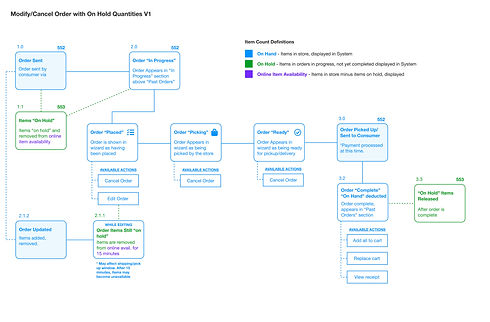
Key UX Steps: Information Architecture and Service Blueprints
A clean and simple user interface is supported by an intentional and detailed information architecture and service blueprints that holistically map the app. Doing these steps is the best way to deliver complexity to users without overwhelming the experience.


Design System Considerations
01
Shared Component Library
Working closely with the development team, we matched (XD) design components to a Storybook library to reference for ongoing design.
02
White Label Variability
As a B2B software tool, each retailer's unique brand identity needed to be visible in the UI and easily customizable on the backend without overburdening the architecture team.
03
Accessibility
The app underwent an extensive 3rd party accessibility audit to ensure retailers that it met or exceeded WCAG guidelines. I met with the audit team weekly to review feedback and implement recommended improvements.
04
Mobile First
Prior to this redesign effort, the service was developed as a desktop first experience. In order to modernize and meet demands of shoppers during the pandemic, I designed the UI for mobile devices and scaled it to other form factors.
Testing with Prototypes
The team regularly tested new features with users through usability testing on high fidelity click-through prototypes. These tests allowed us to make quick iterations before an upcoming release.